

Financial Analyst Dashboard

I worked as part of a multidisciplinary team, including a business analyst, data scientist, back-end developer, and designer, to design the UI and build an interactive prototype for a major financial institution. The application was intended to help analysts understand the performance of the articles they authored and prioritize follow-up engagement with readers.
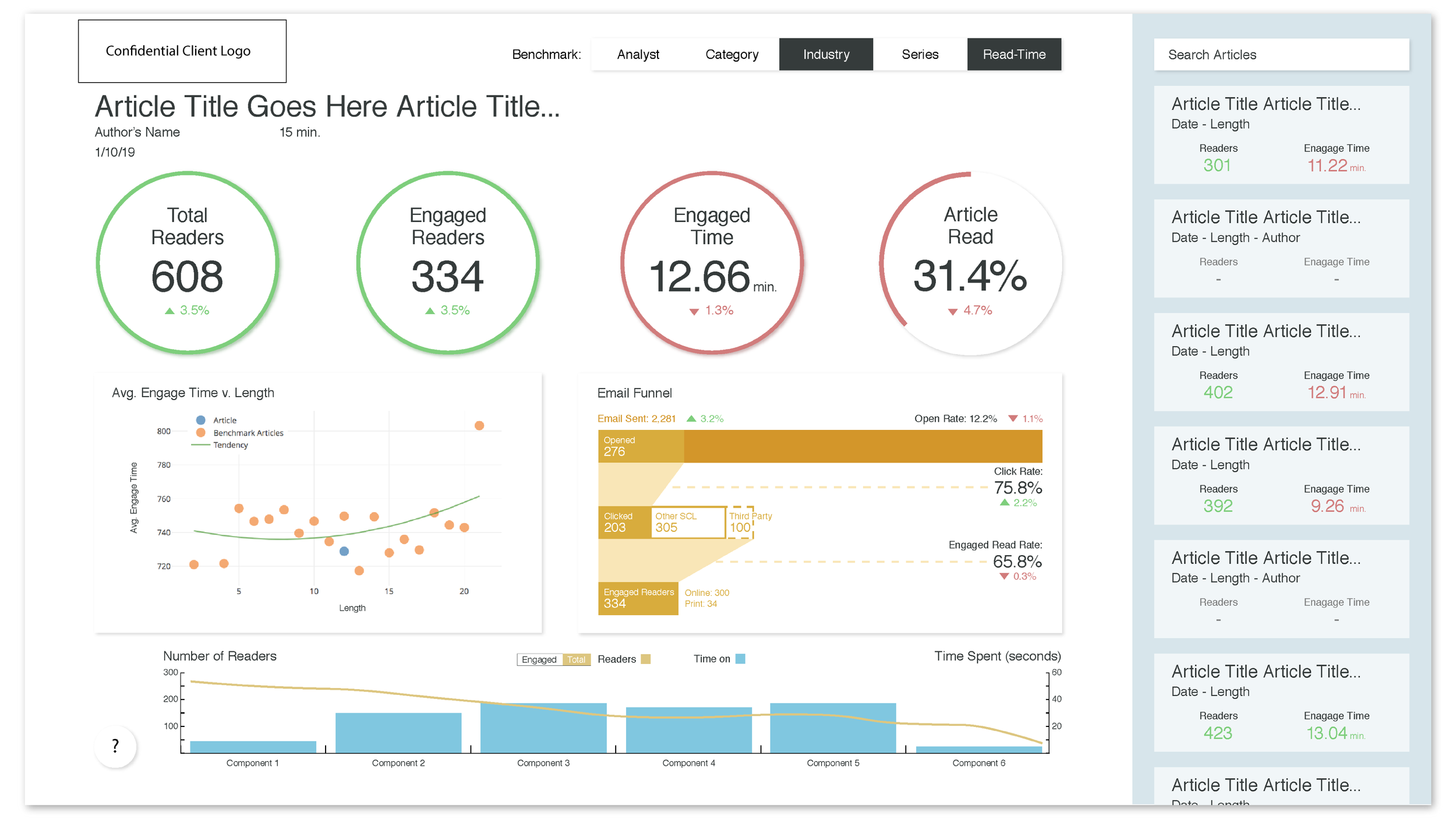
The product centered on two primary views:
Article Overview: performance and engagement insights at the individual article level
Author Overview: aggregated insights across an analyst’s body of work
Team Challenges:
No direct access to the end-user base
A highly compressed project timeline
Limited access to proprietary data
Solutions & Approach:
In lieu of direct user access, we developed targeted, structured questions for stakeholders and proxy users to answer while reviewing designs and prototypes, allowing us to extract meaningful, actionable feedback.
To meet aggressive deadlines, design and development progressed in parallel, with rapid iteration cycles informed by continuous feedback.
We used thoughtfully simulated data to represent realistic usage scenarios and demonstrate the full range of potential insights and UI states without exposing proprietary information.
Personal Challenge & Growth:
I joined the team specifically to lead UI design, which required quickly ramping up on both the project scope and the financial services domain.
By rapidly synthesizing input from subject-matter experts and collaborating closely with the team, I was able to design a clear, intuitive interface that aligned with analyst workflows despite limited domain familiarity at the outset.
Additional interaction views are included below:


